4Smile
Healthcare Patient Engagement Portal
website
website
The main objective is to create a sleek and minimalist design that requires users to input only essential information. The goal is to provide a quick and effortless method for users to locate and get in touch with nearby doctors or clinics.
A competitive analysis is crucial for designing the 4Smile app. It provides insights into the market, identifies opportunities for differentiation. Studying similar medical apps like Zocdoc, Practo, and MyChart gives knowledge about successful features and user experiences. This analysis identifies gaps for unique value in 4Smile. Leveraging strengths and addressing weaknesses creates a compelling user-centric app, gaining a competitive advantage. The analysis guides design decisions, shaping the strategy for 4Smile to stand out and meet user needs effectively.
| Medical App | Zocdoc | Practo | MyChart |
|---|---|---|---|
| Advantages |
|
|
|
| Disadvantages |
|
|
|
| Key Features |
|
|
|
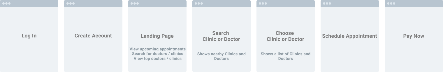
Creating a user flow before designing it helps plan and visualize the user’s journey. It outlines the steps users will take to complete tasks and achieve their goals. This process ensures a clear understanding of the app’s structure and navigation.
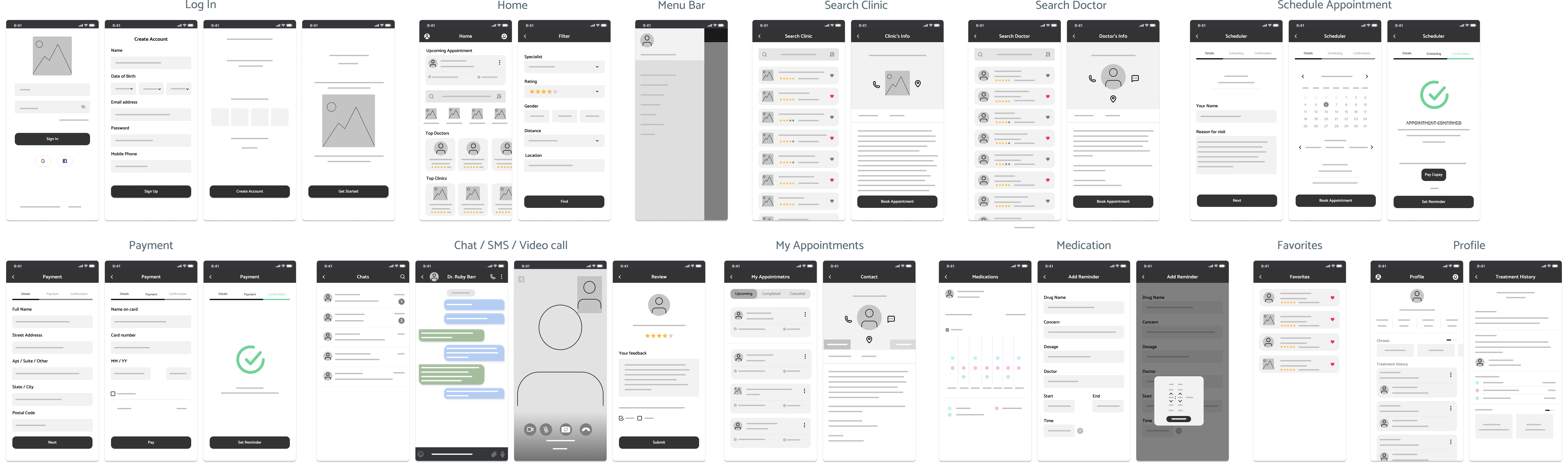
Sketching the wireframe creates a visual blueprint of its layout and functionality. It allows for quick iteration, exploration of design concepts, and testing of user flows. The wireframe ensures alignment with the intended user experience and serves as a foundation for the app’s visual design.
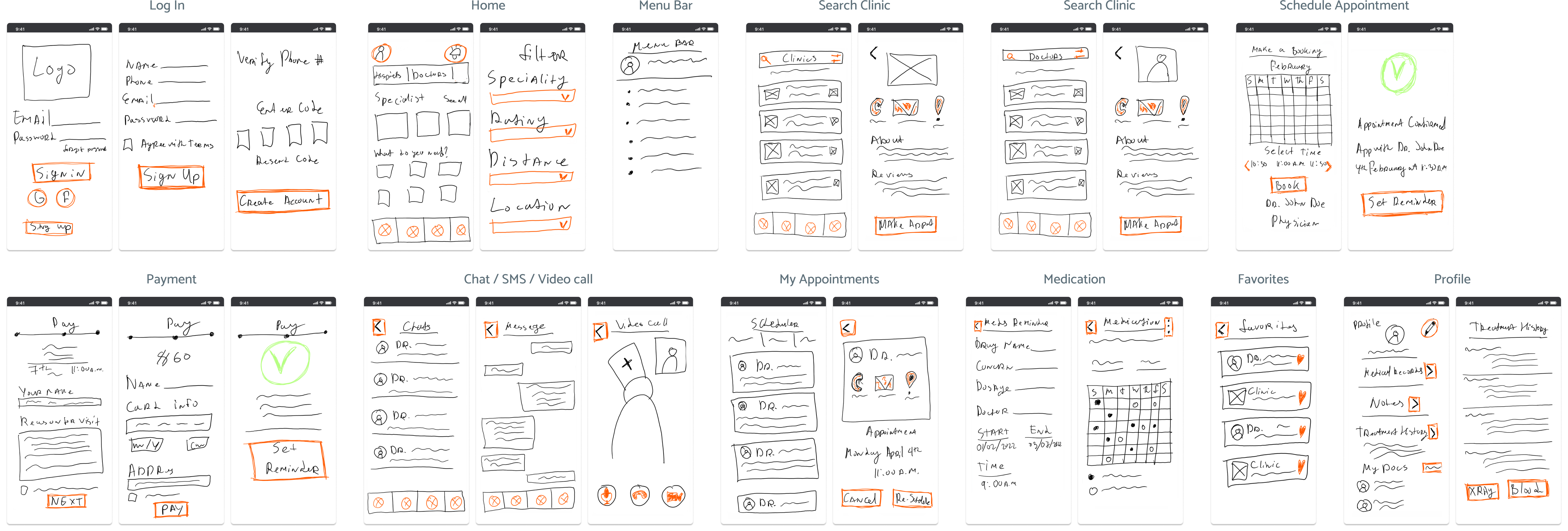
Transitioning to low-fi wireframes after sketching, serves a specific purpose. Low-fidelity wireframes allow me to focus on the app’s overall structure, content placement, and user flow without getting caught up in visual details. By using simple shapes, placeholders, and minimal styling, low-fidelity wireframes facilitate quick and iterative design iterations, enabling me to gather feedback and make necessary adjustments early in the design process.
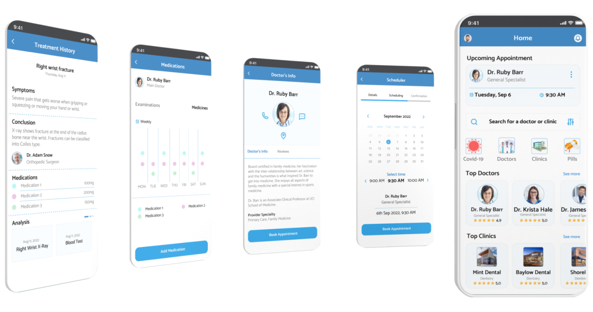
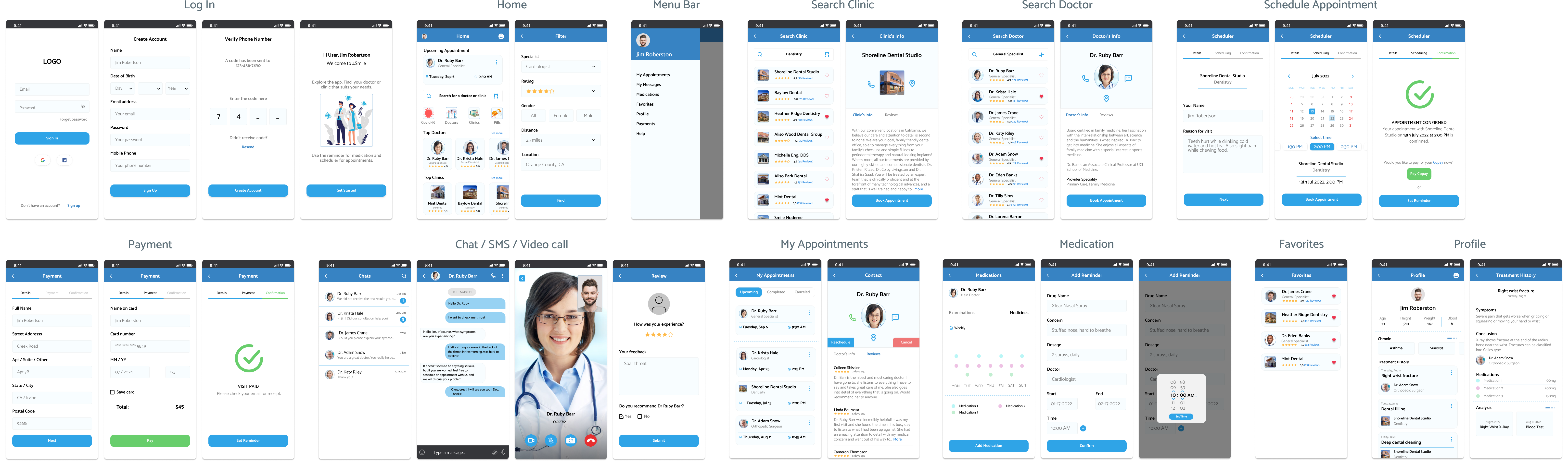
At the final stage of the design process, the high-fidelity wireframe takes center stage. It incorporates detailed visual elements, typography, colors, and refined user interface components. This elevated level of fidelity serves the purpose of accurately representing the app’s ultimate look and feel, offering a realistic preview of the user experience.
Experience the interactive prototype of the 4Smile medical app, crafted in Figma.
The journey of designing the 4Smile medical app has been an exciting and rewarding project. From conducting a competitive analysis to sketching wireframes, creating low-fidelity and high-fidelity designs, every step has contributed to shaping a user-centric and visually appealing app.
The research and analysis of similar medical apps have provided valuable insights, allowing for the identification of unique features and improvements to differentiate 4Smile in the market.
The wireframing process has helped in refining the app’s structure, user flow, and overall user experience. The transition from lo-fi to hi-fi wireframes has ensured that the final design accurately represents the app’s functionality.
The project has been a collaborative effort, involving stakeholders, team members, and user feedback, which has helped in delivering a polished and intuitive app design. With a clear vision and a focus on meeting user needs, the 4Smile medical app is well-positioned to provide a seamless and efficient experience for users in their search for nearby doctors and clinics.